
How to Read a Current U.S. Forecast Map: Fronts, Storm Systems, Alerts and What to Watch Next
Forecast maps: a daily snapshot of what’s happening across the U.S.
A current U.S. forecast map is designed to answer a simple question: what weather patterns are in place right now, and what are they likely to do next? In one view, these maps typically combine multiple layers—storm systems, cold and warm fronts, rain and snow coverage, and hazard messaging such as watches, warnings and advisories. Used well, the map becomes a planning tool rather than a curiosity: it helps you decide when to travel, when to adjust outdoor plans, and when to check for official alerts in your area.
Many weather platforms also encourage readers to “follow along” with the latest weather being monitored, the threats it may bring, and to check the extended forecast each day to stay prepared. That approach reflects how forecasting is used in real life: the map gives context, while the day-by-day forecast provides the details that matter where you are.
What you’re seeing on a “current surface” map
Most national forecast maps include a “current surface” view. In plain terms, that means the map displays the broad, near-ground weather pattern across the country. The common elements include:
- Current storm systems (often shown with symbols or labeled areas)
- Cold fronts and warm fronts (lines indicating boundaries between air masses)
- Rain and snow areas (shaded regions showing where precipitation is occurring)
This combination is powerful because it links cause and effect. Fronts and storm systems describe the “why,” while rain and snow areas show the “what.” If you only look at precipitation shading, you might miss the larger setup that explains whether an area of rain is fading, intensifying, or shifting direction.
Storm systems: why they matter beyond the icon
Storm systems are the organizing centers of many significant weather events. On a national map, they’re often depicted as broad features rather than local details. The key value is orientation: you can see where the most active weather is concentrated and how it relates to surrounding regions.
When a map highlights current storm systems, it is also setting the stage for the next map layer many people consult: the forecasted storm systems. That transition—from “current” to “forecasted”—is where planning begins. A storm shown today may be the same storm affecting another region tomorrow, which is why it’s useful to monitor the system’s projected track and timing.
Cold fronts and warm fronts: the boundaries that signal change
Fronts are among the most important features on a surface map. A cold front typically marks the leading edge of cooler air pushing into warmer air. A warm front marks warmer air advancing into cooler air. Even without knowing the exact temperatures, the presence of a front often signals a change in conditions—sometimes a shift in wind, a change in precipitation type, or simply a transition from one air mass to another.
Forecast maps that show current storm systems, cold and warm fronts, and rain and snow areas are essentially telling a story about movement. Fronts are rarely static; they help explain why a rain area might expand, why snow might develop farther north, or why conditions can change quickly over a short distance.
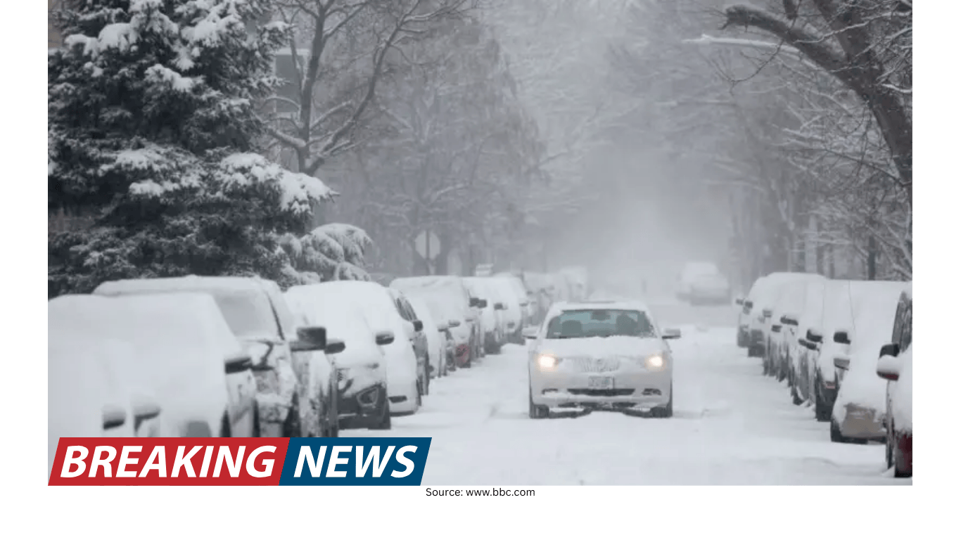
Rain and snow coverage: what the shading does—and doesn’t—tell you
Rain and snow areas are usually shown as colored overlays that highlight where precipitation is falling. This is the layer most people notice first because it’s immediate and visual. But it’s important to treat this layer as a broad guide rather than a street-level promise.
On a national map, precipitation areas are generalized. They can help you understand whether a region is dealing with widespread rain, a swath of snow, or mixed precipitation zones. For decisions that depend on exact timing—like a commute, a flight, or a short outdoor event—the map is a starting point. The next step is to open the forecast details for your location and check the hour-by-hour or daily breakdown.
Forecasted surface maps: looking ahead with the same building blocks
In addition to the current view, many services provide forecasted storm systems, cold and warm fronts, and rain and snow areas. This is essentially the same set of layers, but projected into the future. The benefit is consistency: you can compare “now” versus “next” using the same visual language.
When you switch to a forecasted surface map, you’re asking practical questions such as:
- Will the storm system move toward my region or away from it?
- Is a front expected to pass through, and if so, when?
- Will precipitation coverage expand, shrink, or shift?
These questions matter because they guide what you do next: check the extended forecast day by day, review any active alerts, and plan around the most likely window for impactful weather.
Severe watches, warnings and advisories: the “action layer”
Forecast maps often include a dedicated layer for severe watches, warnings, and advisories in the U.S. This is where the map moves from describing weather patterns to highlighting potential hazards. Even if you don’t memorize the definitions, the intent is clear: these messages are meant to prompt attention and, in some cases, immediate action.
Because watches, warnings and advisories can be issued and updated as conditions evolve, this layer is one of the most time-sensitive parts of the map. It is also a reminder that a national view is only a first step. If your region is within a highlighted area, the next step is to open the alert details and read the specific information for your location.
Short-term precipitation totals: the next 48 hours in inches
Another common map product is a short-term precipitation projection, such as next 48 hours rain and snow across the U.S. measured in inches. This layer shifts the focus from “where precipitation is” to “how much may fall.” That distinction matters for planning, because totals can be more closely tied to impacts than simple coverage.
Two inches of rain over a wide area can mean something different than two inches concentrated in a shorter time window. Similarly, snow totals can help you anticipate where travel may become difficult, even if the precipitation coverage looks similar across multiple states.
As with any forecast product, the map is best interpreted as a broad estimate. For local decisions, it’s wise to pair the national totals view with your daily forecast details.
Using the extended forecast: turning a map into a plan
A recurring theme in map-based forecasting is the recommendation to check the extended forecast each day. The reason is straightforward: the map provides a national overview, but the extended forecast provides the sequence—what happens today, tomorrow, and beyond.
Many platforms place forecast information in a dedicated section—often described as a “weather details” area—where you can find the forecast for the days ahead. When you use the map and the extended forecast together, you can:
- Confirm whether a storm shown on the map is expected to arrive during your travel window.
- Compare day-by-day changes in precipitation chances and timing.
- Monitor whether alerts expand, shrink, or shift as forecast confidence changes.
This is also why “follow along with the latest weather we’re watching” is more than a slogan. The map is a living product, updated as new information becomes available and as the atmosphere evolves.
Seasonal layer: fall foliage as a weather-adjacent map
Not every map layer is about hazards. Some are designed for seasonal awareness and travel planning. One example is a fall foliage map, described as offering the latest reports of fall foliage around the U.S., especially as fall brings an “explosion of brilliant fall foliage.”
While foliage isn’t a storm system or a front, it often appears alongside other national map products because it’s a timely, location-based feature that many people plan around. In practice, it functions like a travel and outdoors layer: it helps you decide where conditions may be visually at their peak and encourages you to check local weather details before heading out.
Accuracy claims and what they mean for readers
Some forecasting services include an accuracy statement, noting that they are described as the world’s most accurate forecaster according to a ForecastWatch “Global and Regional Weather Forecast Accuracy Overview” covering the 2021–2024 period and commissioned by The Weather Company. Accuracy claims like this are meant to provide context about forecasting performance over time.
For readers, the practical takeaway is not to treat the map as a guarantee, but as a tool informed by ongoing forecast verification and improvement. Even with strong performance, weather remains variable—especially at local scales—so the best approach is to check updated forecasts regularly, particularly when storms or alerts are involved.
Data and privacy: understanding the standard notice
Many weather sites and apps include a privacy notice acknowledging a responsibility to use data and technology for good, and stating that they may use or share your data with data vendors. These notices often encourage users to take control of their data through privacy settings.
For map users, this is relevant because interactive weather products frequently rely on location inputs and device data to personalize forecasts. If you prefer not to share certain information, the privacy settings are typically where you can review and adjust those choices.
A practical checklist for reading a U.S. forecast map each day
If you want to make forecast maps part of your routine—without getting overwhelmed—use a simple sequence. This mirrors how many platforms structure their map offerings and forecast details.
- Start with the current surface map: Identify the main storm systems and the position of cold and warm fronts.
- Check the precipitation layer: Note where rain and snow areas are located now.
- Switch to the forecasted surface map: See where those systems and fronts are expected to move.
- Review severe watches, warnings and advisories: If your area is included, open the alert details.
- Look at next 48-hour rain and snow totals (in inches): Use it to gauge potential accumulation and disruption.
- Confirm with the extended forecast: Use the day-by-day forecast in the weather details section to plan timing.
Why the map is only the beginning
A national forecast map is best thought of as an overview: it summarizes current storm systems, fronts, and precipitation, then projects those elements forward. It also provides a quick way to see where severe watches, warnings and advisories are active, and where significant rain or snow totals may occur over the next 48 hours.
But the most practical forecasting happens when you move from national context to local detail. That’s why the daily habit matters: follow the latest weather being monitored, check what threats it may bring, and consult the extended forecast each day so you’re prepared as conditions evolve.